Interactive Maps to Visualize the More Than 10 Million Americans Who Moved from One County to Another
Sponsors
<-- Free Geography Maps
<-- Free U.S. State Shapefiles
<-- Free World Country Maps
Map: Where Americans Are Moving by Jon Bruner
Source: Forbes
Wonderful resource for determining migration in and out of U.S. counties - includes per capita income. This is a map created by clicking on Denver County, Colorado.
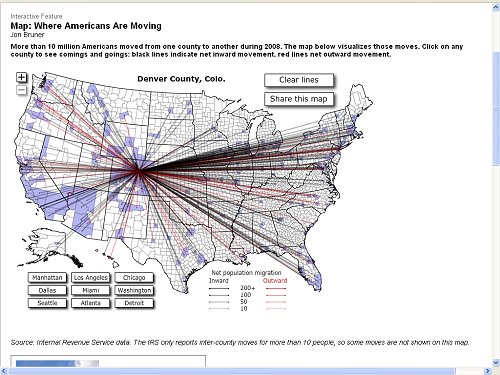
Black lines indicate movment into county and red indicate movement out of county.
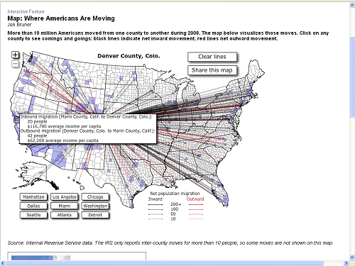
The second maps shows number and income of people that moved between Denver county and Marin county.
More than 10 million Americans moved from one county to another during 2008. The map below visualizes those moves. Click on any county to see comings and goings: black lines indicate net inward movement, red lines net outward movement.
Source: Internal Revenue Service data. The IRS only reports inter-county moves for more than 10 people, so some moves are not shown on this map.
Interact with the county migration maps.
<-- Free Geography Maps
<-- Free U.S. State Shapefiles
<-- Free World Country Maps
Didn't find what you are looking for? We've been online since 1996 and have created 1000's of pages. Search below and you may find just what you are looking for.
Michael R. Meuser
Data Research & GIS Specialist
MapCruzin.com is an independent firm
specializing in GIS project development and data research.
We created the first U.S. based
interactive toxic chemical facility
maps on the internet in 1996 and we
have been online ever since. Learn more about us and our services.
Have a project in mind? If you have data, GIS project or custom shapefile needs contact Mike.
Contact Us
Report Broken Links
Subscribe for Updates
Sponsors
|